Thank you for an excellent semester. You are talented group: with sufficient diligence, I have no doubt that you have the ability to excel as designers.
I have finished marking all of your Projects, and have submitted your final grades. Note that I am not permitted to deliver your final grades directly to you.
Project Two was an exciting experiment. I appreciated the wide variety of representational styles on display, and I hope the Project caused you to consider the nature of your own personal style. I was disappointed in your co-ordination as a class, and this is reflected in the grades.
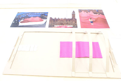
Project Three was consistently well executed, though very few of you excelled in all areas. There were a few standout drawings and models, as reflected in the grades. Some projects were successfully site specific and responsive to the forces at play; others were successful formal experimentations, sculptural in their own right. Very few were both.
Feel free to keep in touch, and have a great 2009.
-Jesse
Wednesday, December 31, 2008
Monday, December 29, 2008
Wednesday, December 24, 2008
Tuesday, December 23, 2008
Monday, December 22, 2008
PROJECT 3 - EVE ZORAWSKI: Suburban Intervention

3:1 DESIGNER'S STATEMENT
3:2 PERSPECTIVES
3:3 ORTHOGRAPHIC DRAWINGS
3:4 SCALE MODEL
I found that Puryear’s work, being almost humble, required a different kind of presentation than the traditional. With this inspiration, I intended to generate the viewer’s experience to be variable. I designed a several different vantage points, which enables viewers to experience the piece in whichever way they feel comfortable. One can look up at, sit beside or stand on the same level as the piece. I also created several entrances/exits that enable the gallery to have more than one configuration of traffic flow. With the form of the gallery, I intended to create a simple design in order to facilitate Puryear’s sculpture to stand out with ease. The space is relatively enclosed to provide protection from the street and surrounding environment, though I left carefully placed reveals in order to generate curiosity and interest of the passersby.


Sunday, December 7, 2008
ART GALERY for VESNA PERUNOVICH. By Anna Totska.
SITE.
The site is a path that leads to a McCowan subway station in Srarborough. The interesting fact about the site is that is seems completely unoccupied, compare to the surrounding land. Where it is all busy shopping malls, highways, residences. In fact, this piece of "desert" is being used daily by a large number of people, as the path leads to a subway. Therefore, this territory needs some fresh look.
PLAN.
The concept is to create an unusual experience without interrupting people's daily routine. Where the routine is walking to or from the subway. The gallery simply becomes part of the path. While walking to the subway people could look at the exhibition. If they are interested, they are welcome to come in and take a look closely, if not, they would just follow their usual path.
EXPERIENCE.
The order of the exhibition is designed in a way that viewer is thrown directly into interaction with the art work, knowing nothing about the author. This, I believe, would clear all expectations and let viewer enjoy work as it is. Later, in the middle section of the art gallery viewer could learn about the author and more specific art works.
PERSPECTIVES.


MODEL.


DRAWINGS.

Project Three, Part Two: Tiffany Huta

Anish Kapoor’s Taratantara at First Canadian Place
Just like many other business buildings, First Canadian Place is a very linier building. This angularity provides a famous contrast for Anish Kapoor’s curvy streamline large sculpture. The contrast between the two elements works the same as a building in the downtown core, the building has to be able to adapt to its cellular human interaction. The sculpture Taratantara, emulates the characteristics of the human body in which the piece also combines this idea of a unity through contrast. The gallery elements are placed strategically to help break up the space and to allow for different viewpoints of Taratantara. Most of the Gallery elements are place in the middle of walking areas to create a distraction. The Elements are place as such to make people be aware of their surroundings. The open gallery concept of First Canadian Place provides ample room for Taratantara and is an ideal place for it to be seen along with the other gallery elements because of the vas amount of people who pass through the building using the PATH daily.
Final Model:


First Model:

Perspectives:


Drawings:


Subscribe to:
Comments (Atom)


